

So what the heck do these decorative words of garnish mean? Scale, as you will often here us say, is not a word to be taken lightly. Oh No! It is one of THE most important and FANCY tools a designer has in their back pocket. (next to the skittles, and melted abba zaba bar. YUM!)

So what is it? (it is a delightful and yummy taffy with peanut butter filling and.....OH! you were referring to the topic of scale, of course, ..FOCUS)
Scale and proportion are in comparative relation to a WHOLE. It is the relationship of one thing to another.

Here you can see a great example of poor scale. This is a beautiful room with great color, however the rug and lamps are lacking severely in scale. They are too small for the room. To make matters worse these items are paired against a large sofa. I don't know about you, but I could see myself TRIPPING a thousand times on that rug and holding the lamp in the air while I tried to drink out of my sippy cup, I mean read an important novel. This room has potential and could easily be fixed, but as shown, gets a grade F, from AB HOME.

Another great room at first glance, however the sofa is a bit short for the high ceilings, and the beautiful egg chair is dwarfing it; especially by putting it in Black, a strong bold choice, compared to the rest of the room. This room looks unbalanced to me, (hey whats in this sippy cup anyways?)

Pic 3.
This room is lacking a lot. It definitely needs a designers touch! This is a great example of single width draperies gone wrong! They have installed the rods on the trim ( no, no, no) and the panels are too skinny (GO BIG or GO HOME) for the size of the room and furniture. The sofas are large and over stuffed so to pair them with wimpy draperies is incorrect scale and proportion. This room has potential, but also fails by AB HOME standards (it's the GOLD standard of opinions that matter!).
This room is lacking a lot. It definitely needs a designers touch! This is a great example of single width draperies gone wrong! They have installed the rods on the trim ( no, no, no) and the panels are too skinny (GO BIG or GO HOME) for the size of the room and furniture. The sofas are large and over stuffed so to pair them with wimpy draperies is incorrect scale and proportion. This room has potential, but also fails by AB HOME standards (it's the GOLD standard of opinions that matter!).

Pic 4.
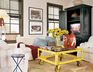
This room gets a C-. Overall I think the design concept is strong. The mirror helps expand the space and the sofa and side table mix well together. Where this room falls off the train (hehe, I crack myself up) is the train car coffee table. It is WAY too low to the ground. This sucker will bite you in the shin right where it H-U-R-T-S! To have something this low, with pointy glass corners, ALL WRONG, and screams ouchy!
This room gets a C-. Overall I think the design concept is strong. The mirror helps expand the space and the sofa and side table mix well together. Where this room falls off the train (hehe, I crack myself up) is the train car coffee table. It is WAY too low to the ground. This sucker will bite you in the shin right where it H-U-R-T-S! To have something this low, with pointy glass corners, ALL WRONG, and screams ouchy!

Phew! That was rough. So now you have been lectured 4 ways to Sunday on what NOT TO do. Here are a few examples of spaces that got it right, and show what
TO do:

Vicente Wolfe
Simple four poster bed brings the eye up and high lights the high ceiling. The draperies are proportionate to the room size and interiors (remember pic #3?). The wing back chair has a generous height, and the texture of fabrics, wood and stone mix well to create an ascetically pleasing room. Your eye gracefully bounces around the room with effortlessness (notice the louis XV headboard mixed with streamlined four poster bed. Genius!)
Simple four poster bed brings the eye up and high lights the high ceiling. The draperies are proportionate to the room size and interiors (remember pic #3?). The wing back chair has a generous height, and the texture of fabrics, wood and stone mix well to create an ascetically pleasing room. Your eye gracefully bounces around the room with effortlessness (notice the louis XV headboard mixed with streamlined four poster bed. Genius!)

The Ludlow
Keeping the wall color a soft white allows the beige sofa to coordinate nicely with the white leather chairs, and beige rug. The clear glass table tricks the eye in thinking there is more space and makes it feel more open. The pictures elongate the room and over all the interior is soft and easy to read. (also notice that the chairs and sofa are similar in height.)


Keeping the wall color a soft white allows the beige sofa to coordinate nicely with the white leather chairs, and beige rug. The clear glass table tricks the eye in thinking there is more space and makes it feel more open. The pictures elongate the room and over all the interior is soft and easy to read. (also notice that the chairs and sofa are similar in height.)

This is a good alternative to Pic number 4 above. This table is very similar but the scale and proportion are correct for the room. This would be easy to set a drink on, and if you happen to bump into it the knee won't cry nearly as much as the shin. Although if you hit a bright yellow table you may want to get glasses, and put down the sippy cup! Pic courtesy of country living .
.

Everything about this room is balanced and perfect. The draperies are the correct widths, the chairs and sofa are an excellent size for the ceiling height and the fireplace and armoire balance the left and right side of the room. Just Beautiful.

Those last four pictures are superb examples of excellent scale and proportion. The rooms are easy on the eyes, easy to read, and they don't feel "off". The Vicente Wolfe photo and the Country living photo are great examples of drapery widths in proportion to the other items in the room (especially compared to Pic 3.) Magnificent! Want to explode your brain on the mathematical elements of proportion and symmetry? Read this book
 (shown above). There is a reason why things feel "off" if Scale is out of proportion
(a mathematical mad scientist reason!!!)

In the Pink is a beautiful collection of Dorthy Draper projects. One of the most iconic figures of the 20th century, Dorthy Draper was a HUGE advocate of scale and ALWAYS used it in her commercial interiors. She hated and almost refused to work on residential projects because she not only wanted FULL control of her projects but she wanted things larger than life! Bravo! The BEST part, she didn't start her momentous career until she was 40! With no education and three children she set out to change the world, and we are still talking about her 30 years after her death! A true mythical, creative creature, of imaginary folklore!
You will notice I have added a sidebar of my Top Twenty Interior design books from Amazon! These books will inspire, teach, and recommend some of the best solutions to all your interior design quandaries and help you crusade through one of the BEST industries on the planet!
Check out our store at, AB HOME!
Join our fan page on facebook here!
And don't forget to follow us on twitter!
Additional images provided by:
http://roomenvy.wordpress.com/2008/11/17/mirror-mirror/
No comments:
Post a Comment